Currently your practice may see a subset of the graphs displayed below. We continue to work to ensure all graphs are available and accurate for all of our Members.
The Ortho/Dental Stats tab on the Services page of your Member Dashboard will help you see the results of your patient engagement efforts through Sesame.
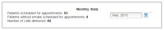
Monthly Stats: The date-picker inside the Monthly Stats tile updates only the three metrics within that tile. The data for the twelve charts below does not change when the date-picker is used.
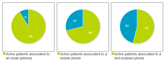
You can hover your mouse over your graphs to see specific information about each field represented.
Active patients associated to an email address: This chart displays the number of active patients who either have their own email address on record or are associated to a responsible party who has an email address on record. These patients are represented by the green pie wedge. Active patients who are not associated to an email address are represented by the blue pie wedge.
Active patients associated to an mobile phone: This chart displays the number of active patients who either have their own mobile phone number on record or are associated to a responsible party who has a mobile phone number on record. These patients are represented by the green pie wedge. Active patients who are not associated to a mobile phone number are represented by the blue pie wedge.
Active patients associated to a text enabled phone: This chart displays the number of active patients who either have their own text-enabled phone number on record or are associated to a responsible party who has a text-enabled phone number on record. These patients are represented by the green pie wedge. Active patients who are not associated to a text-enabled phone number are represented by the blue pie wedge.
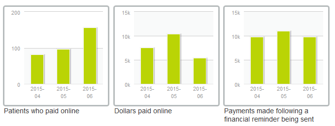
Patients who paid online: This chart displays the number of patients who paid their balance through the patient portal. Three data points are shown in bar format representing the current month and the previous two months. The current month data point will change throughout the month as the data is updated daily. This chart does not include any payments applied directly through the practice management system.
Dollars paid online: This chart displays the number of dollars paid through the patient portal. Three data points are shown in bar format representing the current month and the previous two months. The current month data point will change throughout the month as the data is updated daily. This chart does not include any payments applied directly through the practice management system.
Payments made following a financial reminder being sent: This chart displays the number of dollars paid as a result of a financial reminder being sent. Three data points are shown in bar format representing the current month and the previous two months. The current month data point will change throughout the month as the data is updated daily. This chart does not include any payments made through the patient portal prior to the first financial reminder being.
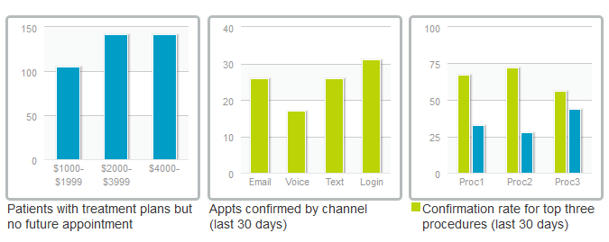
Patients with treatment plans but no future appointments: This chart displays the number of patients for whom an exam has been completed and a resulting treatment plan has been created but for whom no future appointment exists on the schedule. The number of patients is displayed in three columns, each representing a dollar range for the cost of the treatment plan.
Appts confirmed by channel (last 30 days): This chart displays the number of appointments confirmed during the last 30 days. Four data points are shown in bar format representing the number of confirmed appointments by channel; including email, voice, text, and the patient portal. Each of the data points will change daily to reflect the most recent rolling 30 days.
Confirmation rate for top three procedures (last 30 days): This chart displays the percentage of patients who have confirmed (green series) and have not confirmed (blue series) for each of the top three procedures during the past 30 days. Each of the data points will change daily to reflect the most recent rolling 30 days.
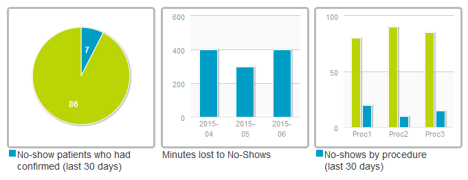
No-show patients who had confirmed (last 30 days): This chart displays the number and percentage of patients who confirmed their appointment but did not show up (blue pie wedge) versus those patients who neither confirmed nor showed up (green pie wedge) during the last 30 days. The total number of no-show patients is the summation of the two data points. Each of the data points will change daily to reflect the most recent rolling 30 days.
Minutes lost to No-Shows: This chart displays the total number of minutes for all scheduled appointments for which patients did not show. Three data points are shown in bar format representing the current month and the previous two months. The current month data point will change throughout the month as the data is updated daily.
No-shows by procedure (last 30 days): This chart displays the percentage of patients who showed for their scheduled appointment (green series) versus the patients who did not show for their scheduled appointment (blue series) during the past 30 days. Each of the data points will change daily to reflect the most recent rolling 30 days.
 Looking for more information? Check out these Related Pages!
Our Member Services team is available Monday through Friday, from 6:00 AM until 5:00 PM Pacific. You can reach us Toll Free at 866 537-8272 (outside of North America, dial +1 206 458-7700) - or use our Contact Form to send us an email.